When we decorate a house, the choice of color is one of the most important decisions . Depending on the color we choose, we will opt for one painting or another, for some furniture or others, for some accessories or other very different. In general, when we decorate, we do not use a single color, we usually move by one, two or three color ranges. The way to combine colors is very personal. There are people who prefer to use two cold color ranges, two warm chromatic ranges or play with the contrast generated from the combination of both types of house colors.
If you are looking for modern inspiration to decorate the interior of your home , in this article we present 10 colors for stylish homes
1. Navy, a fashionable color for spring-summer
The navy color for years is a trend in all sectors of fashion and decoration. This type of color, which usually combines dark blue with white, takes us to the sea and the beach, something that makes it popular especially during the spring and summer months. It is a very chic color, perfect to combine with practically all kinds of decorative styles.
If you are thinking of painting the walls of your home, the navy color is a very good option to generate contrasts . A room painted all in dark blue is crazy (mostly because the only thing we will achieve is to belittle it), but it can be a suitable idea to use in one of the living room walls or the bedroom, using warm colors for the rest . Painting a single wall will help us create depth.
We can also use navy color in furniture or accessories of the house . If you do not want to paint the walls, opt for curtains, paintings, cushions and all kinds of accessories and ornaments that look this color.
2.Black and white, a combination of colors that never goes out of style
The combination of black and white is one of those combinations that pass the passing years, are still fashionable. The case, is that there are no more elegant and sophisticated contrasts that we can create by using these two colors in their proper measure. In general, white is used as a base to give brush strokes of color with black. In this way, bright spaces are created but with character. With this option of colors for houses, it is important that the weight of both colors be compensated , creating spaces full of harmony.
Although this combination of colors to combine in the home goes well with many decorative styles, the Nordic decoration is usually the one that most uses these contrasts. As we already know, in the Nordic decoration the use of white is essential, in this way, they create interiors full of light and luminosity, spacious places that manage to radiate love and serenity. Black is used for small things such as decorative elements, furniture and accessories, achieving an almost magical balance.
Among the multiple options you have when using this color to decorate your home , is to paint one of the walls black. One of the most current ideas in this sense is to use slate paint, which will allow us to write on it. Stripes, polka dots, geometric shapes … are some of the prints that we can find in the paintings and ornaments where black and white are protagonists.
3. Aquamarine, the star color of the vintage style
It is time to decide the colors for houses that will dress your home and you only know that you want a vintage and retro , classic decoration , you have a desperate desire to create an interior of those who tell stories at a glance. In vintage decoration, one of the most used colors is the aquamarine color. A pastel color between blue and green that will help us transmit calmness and serenity to our home.
Furniture, cabinets, walls, decorative accessories and textiles … We can find all kinds of objects in this color. In addition, despite being a color that belongs to the range of cold, creates very homely and intimate spaces.
4. Beige, a classic color to decorate your home
The beige or cream color is an ideal choice to create warm spaces that preserve the classicism of yesteryear. The homes decorated in this color, usually convey a harmony and warmth typical of earth tones.
Choosing this color for a classic interior or glam , is a very good alternative, especially to decorate the living room. It is also a suitable color for rustic interiors, as long as we know how to optimally combine all the colors and elements that come into play in the design that we have foreseen.
Decanting for the beige color is something that traditional people do, who look for simplicity and balance in their home , without great contrasts or striking colors.
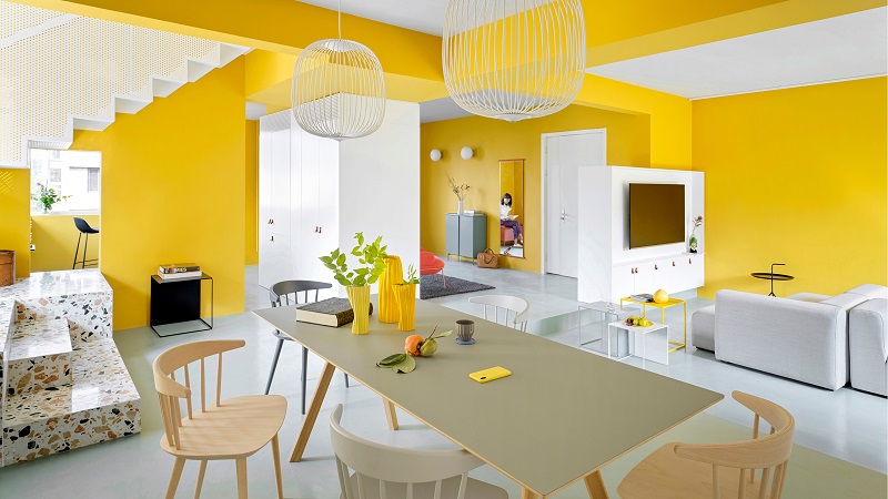
5. Mustard, vitality and energy for your home

Yellow is not usually one of the most popular colors when decorating. It is a risky color and knowing how to combine it is essential so that it is not overwhelming or too heavy. Despite this, the mustard color , which is a strong yellow close to ocher, has become popular in interior decoration in recent years. The grace of this color is knowing how to use it in its proper measure, choosing that color that complements it, achieving balance.
If you want to decorate your house with a color full of energy and vitality , mustard color is the color you are looking for. However, you must be very clear about how you are going to use it before you get down to work. If we pass, we’ll get tired of it soon, and you do not want to repaint the wall of your house two weeks after doing it, right?
If you think that a wall in mustard color is too much, you can choose to choose furniture, paintings, textiles and other complements from the home that give brushstrokes of color, but in fair measure.
6. White, ideal to expand the space and gain luminosity
One of the typical problems when decorating a floor or choosing the colors for suitable houses is the size of the house itself. Today, living in the city means giving up large and spacious houses, having to engineer ourselves to get in 50 square meters what many people have in more than 100. Among the multiple ways we will find to expand and save space, we have the Choose a neutral color, such as white.
White is one of the star colors in the decoration of super minis spaces , whatever the decorative style. In addition to expanding the space visually, it is easy to combine with any other color.
On the other hand, the white color catches the light, so it gets more luminous spaces , that’s why the Nordic decoration uses it. At the end of the day we know that in the Scandinavian countries, during the winter months, there are few hours of light, from that to their interiors are white.
7. Coral, create a warm interior in your home
One of the colors that competes directly with aquamarine in vintage decoration, is the coral color, both colors are preferred in vintage themed blogs, something that translates into its great success in interior decoration. The coral color is one of those colors for houses that have emerged in recent years and that have been gaining popularity for the way in which it creates warm and aesthetic interiors . In addition, the similarity it has with pink and salmon, make it suitable for decorations and romantic environments .
The coral color is easy to combine, especially with neutral tones such as white, beige, cream and gray . As for the accessories, choose accessories coral color with other pastel colors, get a very chic look, as if it were a fairy tale house.
8. Gray, elegant and sophisticated
One of the colors for houses that you can take into account if you are looking for a neutral color, beautiful, easy to combine and that does not overwhelm the eye, is the color gray . Within the range of grays, you can choose from a lot of tones, from a very light gray to a gray so dark that you can end up mixing with black. The case is that using the palette of grays when decorating is very grateful and cra interiors very elegant, sophisticated and serene.
From the classic style, vintage and retro to the rustic, modern and minimalist style, the gray color can be used in any type of interior decoration .
Being a color so used in decoration, we can find all kinds of furniture and decoration accessories with this color range . In general, gray is usually combined with white. We can also combine it very well with pastel colors.
9. Red, put passion to your home with a fashionable color
The color red is one of those colors for houses that we must use carefully and head . It is a complicated color, that everyone does not like and that has a lot of personality on its own. If you want to paint a flat to rent it, it is better to choose another color that is less striking. In addition, it tires to the sight, reason why it is not necessary to abuse this color in the walls of the home, you can use it to create depth in one, but it is not advisable to do it in all.
However, the color red is a very fashionable color , which is increasingly found in our homes either in the form of furniture, textiles or accessories. They attract a lot of attention, so we have to choose very well where we put each object, trying to make the combination balanced and harmonious.
10. Gold, for luxurious interiors and full of glamor
Finally, we present the golden color , a color that really likes or scares and that can offer us that feeling of power, luxury and glamor that we seek, according to a very defined personality. Being a color that shines a lot, using it excessively can tire us. The best thing is to use the golden color in small proportions, combining it with other colors that manage to counteract its brilliance.